Color Picker Deep Dive: How Designers Choose Colors & Why It Matters for SEO
Color choice is not just about aesthetics—it shapes how users interact with your site and even affects your visibility in search engines. Here’s how designers use color picker tools, the latest color trends, and why the right palette is central to branding, accessibility, and SEO.
How Designers Use Color Picker Tools
Choosing, Matching, and Testing: Designers start with color picker tools to select exact hex, RGB, or HSL codes. These tools help match brand colors, generate harmonious palettes, and preview how colors look together on screens.
Online Color Pickers: Popular tools like Adobe Color, Coolors, and browser extensions let designers select colors from websites, images, or custom palettes with ease.
Accessibility Checking: Many tools now feature contrast checkers and accessible palette suggestions to ensure readability for visually impaired users.
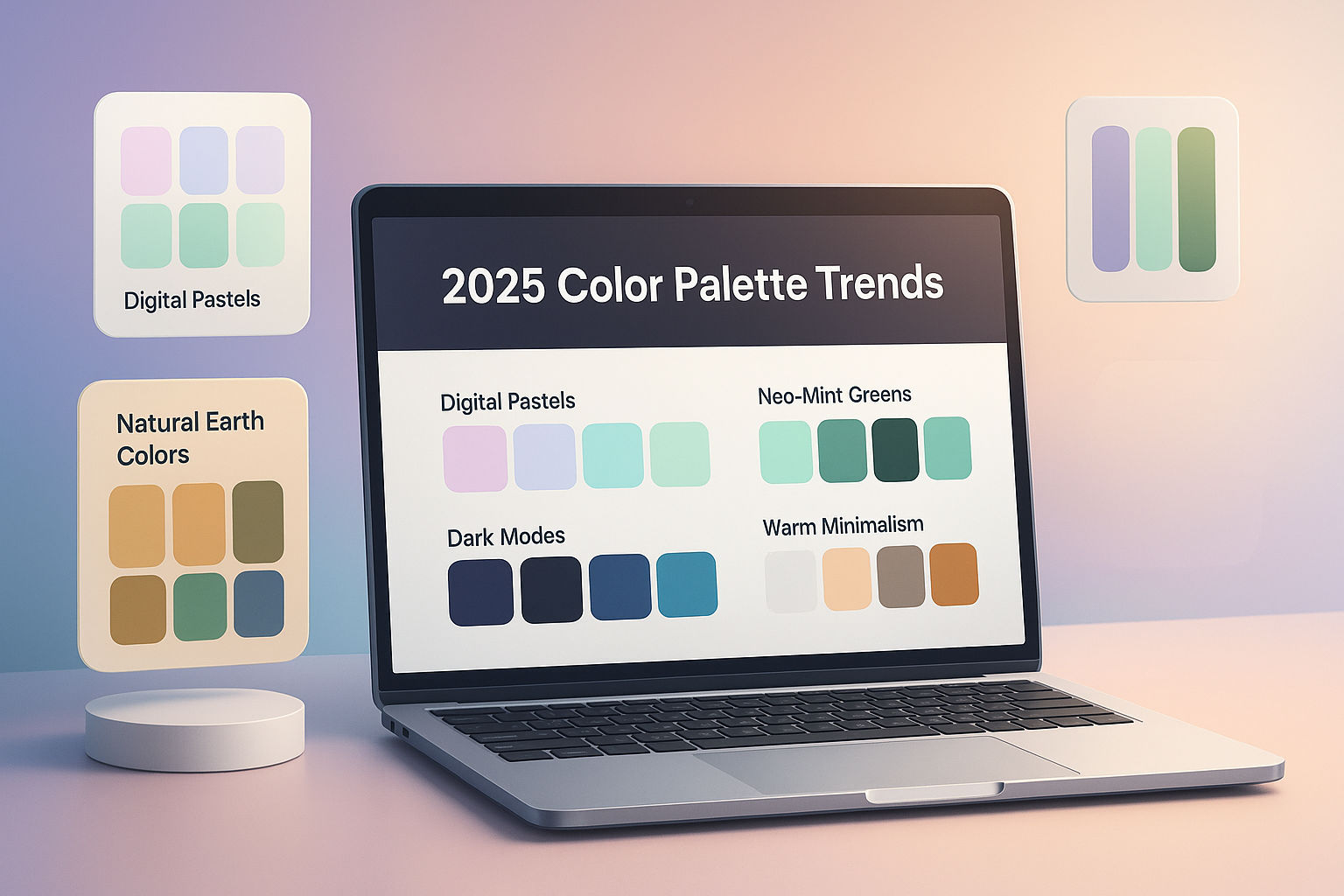
Color Trends for the Web in 2025
Natural & Earthy Tones: Greens, browns, and neutral colors are popular for eco-friendly brands and sites focusing on authenticity.
Bold Accents & Neo-Vintage: Strategic use of neon, retro, or pastel pops to add energy while maintaining overall balance.
Inclusive & Diverse Representation: Palettes representing a wider range of skin tones and cultures showcase brand responsibility and appeal to broader audiences.
Dark Mode & Muted Shades: With dark mode now standard, muted blues and grays are trending, improving eye comfort and prolonging device battery life.
Why the Right Palette Impacts Branding, Accessibility & SEO
Brand Recognition: Consistent color schemes are proven to increase brand recall. Major companies are instantly recognized by their colors.
Accessibility & User Experience: Good contrast and readable color choices make sites usable for everyone. Accessible sites lower bounce rates and improve conversions.
SEO Relevance:
Accessible colors improve user experience signals—Google factors these into rankings.
Brands with clear identity (supported by distinctive palettes) often earn more backlinks and social shares.
High contrast improves readability, which helps in-page SEO and time-on-site metrics.
Tips for Designers & Writers Use color picker tools to test your palettes for contrast, accessibility, and brand alignment.
Stay updated with color trends but anchor your choices in your brand’s identity and audience preferences.
Make sure your site is visually inclusive—accessible colors and palette choices expand your reach and improve your reputation.
Don’t forget SEO: Engaging, readable, well-branded color schemes give both users and search engines what they want.
The perfect palette does more than look good—it ensures brand consistency, accessible experiences, and higher search rankings. Use color picker tools thoughtfully to stay ahead of both design and SEO trends!
Ready to Try Our Tools?
Put what you've learned into practice with our free image processing tools.